Course: Data visualization in Excel
duration: 11 hours |
Language: English (US) |
access duration: 90 days |
Incompany available

Details
Excel charts are an essential tool for visualizing data. With all the different charts that Excel offers, there is always one that suits your needs. In this training, you will learn which graphs you can use for different data types and how to make these graphs. You start the training by importing data from an existing workbook, Microsoft Access database, and CSV and JSON file formats into a new spreadsheet. Then use the Power Query option to organize your data into columns, rows and labels. Then you will discover the different graphs. You start with a simple line chart to adjust the names, labels, titles, y-axis and x-axis. Then you will discover more and more complex 2D and 3D graphs.
The following charts will be discussed in this training:
- Line Charts
- Column Charts
- Bar Charts
- Histograms
- Area Charts
- Stock Charts
- Radar Charts
- Treemaps
- Donuts
- Box Plots
- Sunburst Plots
- Gantt Charts
Result
After completing this course, you are ready to visualize data effectively using Excel Charts.
Prerequisites
No prerequisites. However, some knowledge of Excel is advisable.
Target audience
Database Administrators, Data analist
Content
Data visualization in Excel
Excel Visualization: Getting Started with Excel for Data Visualization
- Excel charts can be used for a myriad of data visualizations, including categorical data and continuous data, like time-series data. In this course, you'll learn how to bring data into Excel and build and customize various charts.
- You'll start by importing data from an existing workbook into a new spreadsheet. You'll then import data from CSV and JSON file formats and Microsoft Access database files. Next, you'll use the Power Query editor to perform various operations.
- Moving on, you'll create column and clustered column charts and perform various formatting operations on the clustered column chart, such as adding data labels, error bars, axis titles, and trendlines.
- Lastly, you'll create a simple line chart, formatting various aspects, such as the line, background, title, legend, axes, and position of charts relative to each other.
Excel Visualization: Building Column Charts, Bar Charts, & Histograms
Data visualizations in Excel reveal the insights uncovered by
- your data in easy-to-consume representations. You can identify
- categorical values, recognize how parts sum up to a whole, see
- percentages rather than absolute values, discretize continuous
- variables, and approximate the probability density function of
- variables. In this course, you'll build charts to uncover all of
- this information. You'll start by working with column and bar
- charts. You'll then create and differentiate between clustered and
- stacked column charts. You'll move on to formatting and customizing
- bar and column charts before working with 2D and 3D chart types and
- customizing them in various ways. Lastly, you'll work with
- histograms, examining how they work, what they're used for, and how
- to customize them to your needs.
Excel Visualization: Visualizing Data Using Line Charts & Area Charts
- Line charts are possibly the most common type of visualization for time-series data, enabling you to see time trends at a glance. These can be augmented with trendlines, used to visualize time trends in data.
- Stacked area charts are a powerful type of visualization, combining information about trends over time with information about composition and parts of a whole.
- In this course, you'll learn how to create and customize all of the visualization types above.
- You'll begin by exploring the purpose of line charts before moving on to formatting and customizing them.
- You'll then practice using trendlines to evaluate different regression models on data in a line chart. You'll also customize and format these trendlines.
- Following this, you'll work with area charts and stacked area charts, examining, in detail, the several types of stacked area charts in Excel and customizing their appearance.
Excel Visualization: Plotting Stock Charts, Radar Charts, Treemaps, & Donuts
- Data visualization options in Excel are vast. You should choose your visualization type based on the data and what you want to show from it. For example, using High-Low-Close and Open-High-Low-Close charts (also called candlestick charts), you can summarize several stock performance aspects.
- Excel also lets you build radar charts - great for visualizing multivariate ordinal data, such as ratings or scores, to spot strengths or spikes.
- In this course, you'll not only learn how to build and customize the charts mentioned, but you'll also create treemaps to visualize hierarchical data and pie charts to display parts of a whole. You'll then generate pie-of-pie and bar-of-pie charts, both of which use a secondary visualization to complement a pie chart.
- Finally, you'll create donut charts to visualize composition using multiple concentric donut rings to represent points in time.
Excel Visualization: Building Box Plots, Sunburst Plots, Gantt Charts, & More
- Once you grasp how to work with the scope of standard Excel chart types, you can expand into more complex visualizations. For example, you can use box-and-whisker plots to convey a wealth of information about the statistical distribution of a variable and identify outliers in a data series.
- You can use sunburst charts to visualize hierarchical data with differing levels of detail, waterfall charts to show the cumulative effect of positive and negative values, and Gantt charts to illustrate progress toward a goal involving multiple parallel tasks.
- Additionally, you can avail of band charts to quickly eyeball the trend in a line chart, scatter plots to uncover the relationship between two variables, and waffle charts to visualize progress towards KPIs.
- In this course, you'll create all of these charts either via Excel's built-in tools or by building them manually using nifty workarounds.
Course options
We offer several optional training products to enhance your learning experience. If you are planning to use our training course in preperation for an official exam then whe highly recommend using these optional training products to ensure an optimal learning experience. Sometimes there is only a practice exam or/and practice lab available.
Optional practice exam (trial exam)
To supplement this training course you may add a special practice exam. This practice exam comprises a number of trial exams which are very similar to the real exam, both in terms of form and content. This is the ultimate way to test whether you are ready for the exam.
Optional practice lab
To supplement this training course you may add a special practice lab. You perform the tasks on real hardware and/or software applicable to your Lab. The labs are fully hosted in our cloud. The only thing you need to use our practice labs is a web browser. In the LiveLab environment you will find exercises which you can start immediately. The lab enviromentconsist of complete networks containing for example, clients, servers,etc. This is the ultimate way to gain extensive hands-on experience.
Sign In
WHY_ICTTRAININGEN
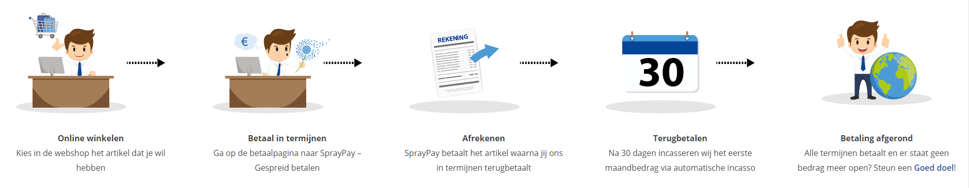
Betaal in termijnen
| Cursusnaam | |
| Looptijd | |
| Rentebedrag financiering | |
| Totaal bedrag | |
| Maandbedrag |

Gespreid betalen met Spraypay
Met de betaaloptie SprayPay kun je jouw bestelling van € 250,- tot € 3.500,- veilig en gespreid betalen in gelijke termijnen van 12, 18, 24 of 36 maanden. Je hebt op die manier een minimale financiële belasting en je kunt eenvoudig de termijnbetalingen opnemen in jouw vaste lasten.
Hoe werkt het kopen op afbetaling? De beoordeling van de kredietaanvraag vindt online plaats. Binnen enkele seconden weet je of je in aanmerking komt voor een krediet. Is de aanvraag akkoord dan kun je meteen genieten van je aankoop.
Let op: deze betaalmetode is aleen beschikbaar voor particulieren! Bekijk voor je aankoop ook de SprayPay voorwaarden.
Via ons opleidingsconcept bespaar je tot 80% op trainingen
Start met leren wanneer je wilt. Je bepaalt zelf het gewenste tempo
Spar met medecursisten en profileer je als autoriteit in je vakgebied.
Ontvang na succesvolle afronding van je cursus het officiële certificaat van deelname van Icttrainingen.nl
Krijg inzicht in uitgebreide voortgangsinformatie van jezelf of je medewerkers
Kennis opdoen met interactieve e-learning en uitgebreide praktijkopdrachten door gecertificeerde docenten
Orderproces
Once we have processed your order and payment, we will give you access to your courses. If you still have any questions about our ordering process, please refer to the button below.
read more about the order process
Een zakelijk account aanmaken
Wanneer u besteld namens uw bedrijf doet u er goed aan om aan zakelijk account bij ons aan te maken. Tijdens het registratieproces kunt u hiervoor kiezen. U heeft vervolgens de mogelijkheden om de bedrijfsgegevens in te voeren, een referentie en een afwijkend factuuradres toe te voegen.
Betaalmogelijkheden
U heeft bij ons diverse betaalmogelijkheden. Bij alle betaalopties ontvangt u sowieso een factuur na de bestelling. Gaat uw werkgever betalen, dan kiest u voor betaling per factuur.

Cursisten aanmaken
Als u een zakelijk account heeft aangemaakt dan heeft u de optie om cursisten/medewerkers aan te maken onder uw account. Als u dus meerdere trainingen koopt, kunt u cursisten aanmaken en deze vervolgens uitdelen aan uw collega’s. De cursisten krijgen een e-mail met inloggegevens wanneer zij worden aangemaakt en wanneer zij een training hebben gekregen.
Voortgangsinformatie
Met een zakelijk account bent u automatisch beheerder van uw organisatie en kunt u naast cursisten ook managers aanmaken. Beheerders en managers kunnen tevens voortgang inzien van alle cursisten binnen uw organisatie.
What is included?
| Certificate of participation | Yes |
| Monitor Progress | Yes |
| Award Winning E-learning | Yes |
| Mobile ready | Yes |
| Sharing knowledge | Unlimited access to our IT professionals community |
| Study advice | Our consultants are here for you to advice about your study career and options |
| Study materials | Certified teachers with in depth knowledge about the subject. |
| Service | World's best service |
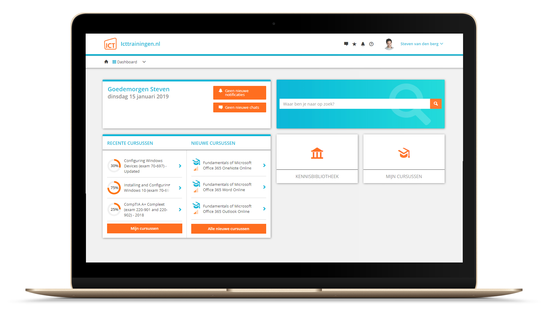
Platform
Na bestelling van je training krijg je toegang tot ons innovatieve leerplatform. Hier vind je al je gekochte (of gevolgde) trainingen, kan je eventueel cursisten aanmaken en krijg je toegang tot uitgebreide voortgangsinformatie.
FAQ
Niet gevonden wat je zocht? Bekijk alle vragen of neem contact op.