Course: Data Visualization with Python
duration: 22 hours |
Language: English (US) |
access duration: 180 days |

Details
This course gives you a comprehensive introduction to data visualization using Python with a focus on three key libraries: Matplotlib, Bokeh, and Plotly. You'll start this course by learning how to install and utilize these libraries to create a variety of visualizations. You'll explore building line charts, bar charts, and histograms, using randomly generated data to create basic line charts. Additionally, the course covers in-depth aspects of box-and-whisker plots, including confidence-interval notches, mean markers, and fill colour, as well as constructing grouped box-and-whisker plots. You'll learn how to effectively visualize data relationships using scatter plots, including the function of jitter in viewing individual data points and configuring scatter plots with continuous value axes. Next, you'll explore both the high-level library (plotly.express) for creating visualizations and the low-level library (plotly.graph_objects) for customizing charts in detail. The course concludes with the construction and applications of advanced charts in Plotly, such as radar charts for presenting multi-dimensional ordinal data along different axes.
Result
After completing this course, you'll have a solid understanding of data visualization in Python, along with practical skills in using Matplotlib, Bokeh, and Plotly to create various types of visualizations and effectively convey insights from your data.
Prerequisites
No formal prerequisites. Basic knowledge of Python and experience in working with data is recommended.
Target audience
Data analist
Content
Data Visualization with Python
Python & Matplotlib: Getting Started with Matplotlib for Data Visualization
Matplotlib is a Python plotting library used to create dynamic visualizations using pyplot, a state-based interface. You'll learn how to correctly install and use Matplotlib to build line charts, bar charts, and histograms in this course. You'll create basic line charts out of randomly generated data. You'll learn how to use the plt.subplots() function, import data from a CSV file using pandas, and create and customize various line charts. Additionally, you'll create figures holding more than one axes object, learn why and how to use the twinx() function, and create multiple lines in the same line chart with different y-axes for each line. Moving on, you'll construct histograms that visualize multiple variables and approximate the cumulative probability density function. Lastly, you'll create some bar charts to represent categorical data.
Python & Matplotlib: Creating Box Plots, Scatter Plots, Heatmaps, & Pie Charts
Matplotlib can be used to create box-and-whisker plots to display statistics. These dense visualizations pack much information into a compact form, including the median, 25th and 75th percentiles, interquartile range, and outliers. In this course, you'll learn how to work with all aspects of box-and-whisker plots, such as the use of confidence-interval notches, mean markers, and fill color. You'll also build grouped box-and-whisker plots. Next, you'll create scatter plots and heatmaps, powerful tools in exploratory data analysis. You'll build standard scatter plots before customizing various aspects of their appearance. You'll then examine the ideal uses of scatter plots and correlation heatmaps. You'll move on to visualizing composition, first using pie charts, building charts that explode out specific slices. Lastly, you'll build treemaps to visualize data with multiple levels of hierarchy.
Data Visualization: Building Interactive Visualizations with Bokeh
An interactive visualization library, Bokeh allows users to create diverse graphics and highly interactive dashboards and data applications. In this course, you'll achieve a foundational knowledge of using Bokeh to build simple graphs and visualizations. You'll start by exploring how to install Bokeh on your local machine, display charts inline within your Jupyter notebooks, and create an interactive visualization. You'll then recognize how to save Bokeh charts as HTML and PNG files. Next, you'll investigate how to visualize categorical data using bar charts, stacked bar charts, and clustered bar charts. You'll also identify how to implement pie charts and donut charts to represent compositions in your data. You'll finish the course by examining the ease of interactivity and granular customizations that Bokeh offers.
Data Visualization: More Specialized Visualizations in Bokeh
Bokeh facilitates the creation of high-performance charts allowing users to build impactful web-based dashboards and applications. In this course, you'll investigate how to visualize your data using complex charts in Bokeh. First, you'll identify how to visualize relationships that exist in your data using scatter plots, discover the function of jitter in viewing individual data points, and configure scatter plots where both axes represent continuous values. Next, you'll outline how to represent relationships between pairs of variables using heatmaps. You'll then recognize the use of line and area charts to visualize time-series data. Finally, you'll explore how to visualize data structures in the form of nodes and edges using network graphs. When you have completed this course, you'll possess the skills and knowledge to build simple as well as complex interactive visualizations using Bokeh.
Data Visualization: Getting Started with Plotly
Plotly is Python's browser-based graphing library, which provides users with online graphing, analytics, and statistics tools. In this course, you'll explore how to use Plotly's declarative APIs to build interactive graphs and visualizations. You'll start this course by getting familiar with the components of the Plotly library. You'll identify the role of the high-level library (plotly.express) in creating visualizations and the low-level library (plotly.graph_objects) in creating granular customizations of your charts. Next, you'll investigate the use of box plots in visualizing the statistical properties of a continuous data series. You'll also discover how to represent additional categorical data by creating separate box plots and customizing their color. Finally, you'll examine how to implement a candlestick chart to reflect the trend of stock price performance over a period of time and visualize sequential data in a linear process using funnel charts.
Data Visualization: Visualizing Data Using Advanced Charts in Plotly
Using data visualizations during exploratory data analysis is an important part of the data science process. The Plotly graphing library helps with this by allowing users to investigate their data through interactive charts. In this course, you will explore the construction and applications of advanced charts in Plotly for varied use cases. You'll begin by identifying how to present multi-dimensional ordinal data along different axes using radar charts. You'll then recognize how to use sunburst charts to visualize multi-level hierarchical data. Next, you'll implement Gantt charts to visualize schedules and timelines in a project and then move on to exploring how to represent the flow of data between entities using Sankey diagrams. You'll finish the course by investigating the use of geo plots and choropleth maps in visualizing geographical data and plot locations.
Creating Infographics and Data Visualization with Python
Perform data visualization tasks such as creating an Infogram project, building an infographic and creating box-and-wisker plots, line charts and histograms. Then visualize relationships using a scatter plot, create a bar chart using Bokeh, and create a box chart using Plotly.
This lab provides access to tools typically used for data visualization, including:
- Jupyter Notebook
- matplotlib
- numpy
- pandas
- Plotly
- Bokehh
Final Exam: Data Visualization with Python
Final Exam: Data Visualization with Python will test your knowledge and application of the topics presented throughout the Data Visualization with Python track of the Skillsoft Aspire Data Visualization Journey.
Course options
We offer several optional training products to enhance your learning experience. If you are planning to use our training course in preperation for an official exam then whe highly recommend using these optional training products to ensure an optimal learning experience. Sometimes there is only a practice exam or/and practice lab available.
Optional practice exam (trial exam)
To supplement this training course you may add a special practice exam. This practice exam comprises a number of trial exams which are very similar to the real exam, both in terms of form and content. This is the ultimate way to test whether you are ready for the exam.
Optional practice lab
To supplement this training course you may add a special practice lab. You perform the tasks on real hardware and/or software applicable to your Lab. The labs are fully hosted in our cloud. The only thing you need to use our practice labs is a web browser. In the LiveLab environment you will find exercises which you can start immediately. The lab enviromentconsist of complete networks containing for example, clients, servers,etc. This is the ultimate way to gain extensive hands-on experience.
Sign In
WHY_ICTTRAININGEN
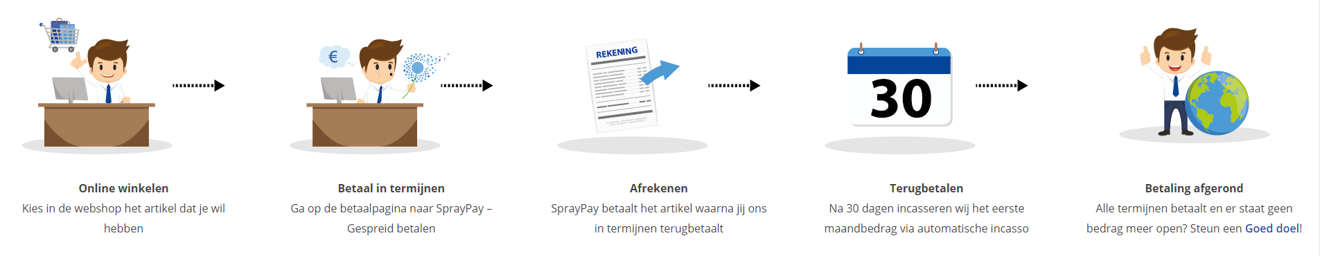
Betaal in termijnen
| Cursusnaam | |
| Looptijd | |
| Rentebedrag financiering | |
| Totaal bedrag | |
| Maandbedrag |

Gespreid betalen met Spraypay
Met de betaaloptie SprayPay kun je jouw bestelling van € 250,- tot € 3.500,- veilig en gespreid betalen in gelijke termijnen van 12, 18, 24 of 36 maanden. Je hebt op die manier een minimale financiële belasting en je kunt eenvoudig de termijnbetalingen opnemen in jouw vaste lasten.
Hoe werkt het kopen op afbetaling? De beoordeling van de kredietaanvraag vindt online plaats. Binnen enkele seconden weet je of je in aanmerking komt voor een krediet. Is de aanvraag akkoord dan kun je meteen genieten van je aankoop.
Let op: deze betaalmetode is aleen beschikbaar voor particulieren! Bekijk voor je aankoop ook de SprayPay voorwaarden.
Via ons opleidingsconcept bespaar je tot 80% op trainingen
Start met leren wanneer je wilt. Je bepaalt zelf het gewenste tempo
Spar met medecursisten en profileer je als autoriteit in je vakgebied.
Ontvang na succesvolle afronding van je cursus het officiële certificaat van deelname van Icttrainingen.nl
Krijg inzicht in uitgebreide voortgangsinformatie van jezelf of je medewerkers
Kennis opdoen met interactieve e-learning en uitgebreide praktijkopdrachten door gecertificeerde docenten
Orderproces
Once we have processed your order and payment, we will give you access to your courses. If you still have any questions about our ordering process, please refer to the button below.
read more about the order process
Een zakelijk account aanmaken
Wanneer u besteld namens uw bedrijf doet u er goed aan om aan zakelijk account bij ons aan te maken. Tijdens het registratieproces kunt u hiervoor kiezen. U heeft vervolgens de mogelijkheden om de bedrijfsgegevens in te voeren, een referentie en een afwijkend factuuradres toe te voegen.
Betaalmogelijkheden
U heeft bij ons diverse betaalmogelijkheden. Bij alle betaalopties ontvangt u sowieso een factuur na de bestelling. Gaat uw werkgever betalen, dan kiest u voor betaling per factuur.

Cursisten aanmaken
Als u een zakelijk account heeft aangemaakt dan heeft u de optie om cursisten/medewerkers aan te maken onder uw account. Als u dus meerdere trainingen koopt, kunt u cursisten aanmaken en deze vervolgens uitdelen aan uw collega’s. De cursisten krijgen een e-mail met inloggegevens wanneer zij worden aangemaakt en wanneer zij een training hebben gekregen.
Voortgangsinformatie
Met een zakelijk account bent u automatisch beheerder van uw organisatie en kunt u naast cursisten ook managers aanmaken. Beheerders en managers kunnen tevens voortgang inzien van alle cursisten binnen uw organisatie.
What is included?
| Certificate of participation | Yes |
| Monitor Progress | Yes |
| Award Winning E-learning | Yes |
| Mobile ready | Yes |
| Sharing knowledge | Unlimited access to our IT professionals community |
| Study advice | Our consultants are here for you to advice about your study career and options |
| Study materials | Certified teachers with in depth knowledge about the subject. |
| Service | World's best service |
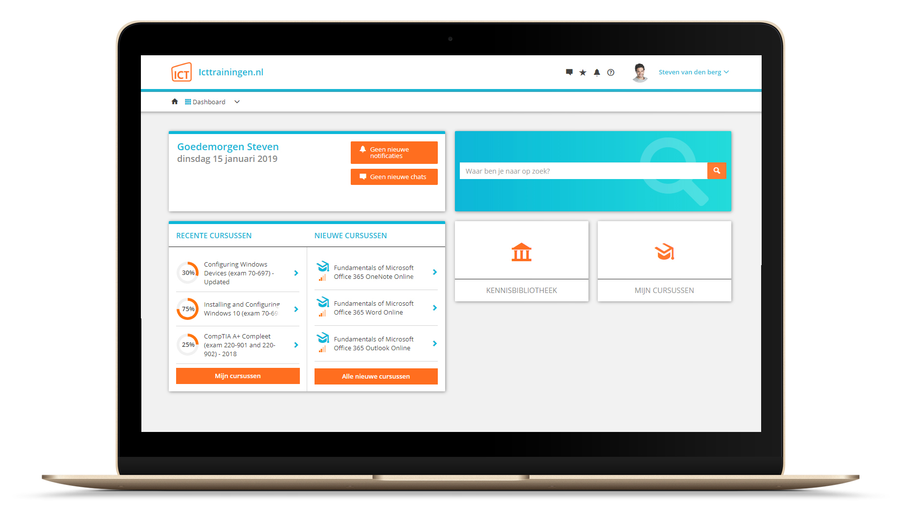
Platform
Na bestelling van je training krijg je toegang tot ons innovatieve leerplatform. Hier vind je al je gekochte (of gevolgde) trainingen, kan je eventueel cursisten aanmaken en krijg je toegang tot uitgebreide voortgangsinformatie.
FAQ
Niet gevonden wat je zocht? Bekijk alle vragen of neem contact op.