Course: Pythonista to Python Master - part 2 Data Visualisation for Web Apps
duration: 24 hours |
Language: English (US) |
access duration: 365 days |

Details
Do you have experience programming in Python and want to take your skills to the next level? Do you want to develop yourself from Pythonista to a real Python Master? Then this development path is something for you!
This is part 2 of the development path Pythonista to Python Master.
With an increase in data analysis, machine learning and web application development, many developers are using Python because of its robust and comprehensive libraries, easy-to-learn syntax and manageability.
This course is taught by an Indian expert.
When you choose this development path, you will get:
- access to the training courses Python for Developers, Data Visualization for Web Apps, Dynamic Data Handling with Python, Restful Web Services with Python, and Resource Optimization with Python. In addition, you get access to many more training courses, mock exams, bootcamps, e-books and so on.
- mentor asset in various training courses.
In this second part of this development path, you will work with Python statistical plots, Python with Altair, and Dash Python frameworks.
Result
After completing this course, you will be familiar with:
- Python statistical plots
- Python with Altair
- Dash Python frameworks
Prerequisites
You have at least basic knowledge and skills in programming with Python. You have followed at least part 1 of this learning path.
Target audience
Software Developer, Web Developer
Content
Pythonista to Python Master - part 2 Data Visualisation for Web Apps
Python Statistical Plots: Visualizing & Analyzing Data Using Seaborn
The wealth of Python data visualization libraries makes it hard to decide the best choice for each use case. However, if you're looking for statistical plots that are easy to build and visually appealing, Seaborn is the obvious choice. You'll begin this course by using Seaborn to construct simple univariate histograms and use kernel density estimation, or KDE, to visualize the probability distribution of your data. You'll then work with bivariate histograms and KDE curves. Next, you'll use box plots to concisely represent the median and the inter-quartile range (IQR) and define outliers in data. You'll work with boxen plots, which are conceptually similar to box plots but employ percentile markers rather than whiskers. Finally, you'll use Violin plots to represent the entire probability density function, obtained via a KDE estimation, for your data.
Python Statistical Plots: Time Series Data & Regression Analysis in Seaborn
Seaborn's smartly designed interface lets you illuminate data through aesthetically pleasing statistical graphics that are incredibly easy to build. In this course, you'll discover Seaborn's capabilities. You'll begin using strip plots and swarm plots and recognizing how they work together using low-intensity noise. You'll then work with time series data through various techniques, like resampling data at different time frequencies and plotting with confidence intervals and other types of error bars. Next, you'll visualize both logistic and linear regression curves. Moving on, you'll use the pairplot function to visualize the relationships between columns in your data, taken two at a time, in a grid format. You'll change the chart type being visualized and create pair plots with multiple chart types in each plot. Lastly, you'll create and format a heatmap of a correlation matrix to identify relationships between dataset columns.
Python with Altair: An Introduction to Altair
This course will get you familiar with the building blocks of Altair visualizations and some of the important chart settings. You will touch upon some of the fundamentals of plotting graphs in Altair. You'll start off by learning about the basic data structures that can form the basis of Altair visualizations, including JSON data and Pandas DataFrames in both wide-form and long-form. You'll then move on to plotting one of the simpler graphs, histograms, to visualize the distribution of values for a quantitative field in your dataset. While doing so, you'll get to explore the different ways in which Altair graphs can be customized including augmenting your chart with text, layering histograms to view two distributions together, and making histograms interactive.
Python with Altair: Plotting Fundamental Graphs
This course will introduce you to a breadth of charts available in Altair and how you can use them to get an all-round understanding of your data. The focus is to get you familiar with the wide variety of graphs that are available. You'll begin by visualizing a distribution of numeric values using box plots and violin charts, each of which has its own strengths and limitations when analyzing distributions. You'll then move on to bar charts to analyze numbers associated with categories in your data. While doing so, you will get to explore a variety of aggregate operations that are available in Altair in order to calculate a sum, mean, median, and so on. You'll then use line charts to visualize the changes in a particular value over a period of time and also its related visual - the area chart. Finally, you'll produce scatter plots to visualize the relationship between a pair of fields in your data. Throughout this course, you'll delve into a number of customizations which are available in Altair for each of the graphs which you plot.
Python with Altair: Working with Specialized Graphs
This course introduces you to the use of Altair visualizations which can convey very detailed information for specialized datasets. You will cover some of the graphs that can be used to convey the information in very specific kinds of datasets, while also giving you some hands-on experience with advanced chart configurations. You'll begin by plotting information on a map, both to mark locations of places as well as to convey numerical information about regions. You'll then build a heatmap to analyze the numbers associated with a combination of two categorical variables. Next, you'll implement candlestick charts to visualize stock price movements, dot plots to analyze the range of movement for some values, and Gantt charts to view a project plan. Finally, you'll explore the use of window functions to analyze the top K elements in each category of your dataset.
Dash Python Framework: Dash for Interactive Web Apps
With Dash, you can create interactive web apps with elements such as buttons, dropdowns, sliders, range sliders, checkboxes, date pickers, and more. In this course, you'll learn how to get started with Dash, beginning with installing Dash and various extension libraries using the pip package installer. You'll move on to building web apps using Dash and the Plotly Express library. You'll also work with two other important Dash extension libraries - the Dash Core Components library and the Dash HTML Components library. You'll put all of these libraries together while exploring some of the default interactivity features, such as zooming and panning charts. You'll create a callback app where the title of a chart updates based on the values on a range slider before creating a more refined app with a callback that updates the chart itself and not just the title. Finally, you'll build a fully-fledged interactive scatter plot.
Dash Python Framework: Leveraging Dash with User Input & Dash DataTable
If you've used Dash before, you'll know how quickly the native HTML table abstraction from dash_html_components can become complicated and cumbersome due to the need to create a TR tag for each row and then individual TD tags within each TR tag for each cell value. Using the dash DataTable abstraction mitigates all of these weaknesses. In this course, you'll practice this technique before using the Dash data table to display data in the form of tables in Dash apps. You may also know that you can harness the power of Dash using HTML components or components from the Dash Core Component library. In this course, you'll also get a chance to work with user input and buttons in Dash apps using the most appropriate components.
Dash Python Framework: Creating Widgets in Dash Apps
The Dash DAQ library can be used to represent data in ways that correspond to real-world physical measurement mechanisms, such as switches, thermometers, knobs, dials, gauges, LED displays, and tanks. In this course, you'll learn how to work with this library. In addition, you'll practice creating widgets using Dash core components. You'll also create Dropdowns, TextAreas, RadioButtons, and Checklists. Finally, you'll cover two important aspects of building web apps - building tabbed apps with different controls on each tab and accepting user upload of files. You'll build a web app that accepts a file for upload, either via drag-and-drop or via direct user navigation, and then checks whether the file is a .csv file and if so, displays the contents of that file in a DataTable.
Data Visualization for Web Apps Using Python
In this practice lab, learners will be presented with a series of exercises to practice developing in Python. Exercises include tasks such as visualizing univariate data using histograms and time series plots. Then use Altair to visualize data in histograms, bar charts, plots, geographic maps and heat maps. Learners will also practice creating a Dash with visualization, different user inputs, and with different components and Dash DAQ. Learners can also use the environment as an open sandbox. No installation or configuration is required, so you can gain immediate hands-on experience. Create new files or upload your own from a storage location of your choice, such as GitHub, and you can practice coding right away! You can even download a copy of your work when you're done. Whether you're looking to dive into the code presented within our courses or you want to work on your own coding projects, this lab environment will provide you with everything you need. So, go ahead and start coding today! See below for a complete list of available software. - Python 3.7 - Python 2.7 - Tkinter GUI - Python 3 libraries: - Django - Flask - Flask-Migrate - Flask-SQLAlchemy - Flask-WTF - beautifulsoup4 - selenium - Python 2/3 libraries: - ipython - pytest - testbook - Pip 2 and 3 - Node.js - npm - Git - Vim editor - Standard Python libraries This lab is part of the Data Visualization for Web Apps Using Python track of the Skillsoft Aspire Pythonista to Python Master Journey.
Final Exam: Data Visualization for Web Apps Using Python
Final Exam: Data Visualization for Web Apps Using Python will test your knowledge and application of the topics presented throughout the Data Visualization for Web Apps Using Python track of the Skillsoft Aspire Pythonista to Python Master Journey.
Course options
We offer several optional training products to enhance your learning experience. If you are planning to use our training course in preperation for an official exam then whe highly recommend using these optional training products to ensure an optimal learning experience. Sometimes there is only a practice exam or/and practice lab available.
Optional practice exam (trial exam)
To supplement this training course you may add a special practice exam. This practice exam comprises a number of trial exams which are very similar to the real exam, both in terms of form and content. This is the ultimate way to test whether you are ready for the exam.
Optional practice lab
To supplement this training course you may add a special practice lab. You perform the tasks on real hardware and/or software applicable to your Lab. The labs are fully hosted in our cloud. The only thing you need to use our practice labs is a web browser. In the LiveLab environment you will find exercises which you can start immediately. The lab enviromentconsist of complete networks containing for example, clients, servers,etc. This is the ultimate way to gain extensive hands-on experience.
Sign In
WHY_ICTTRAININGEN
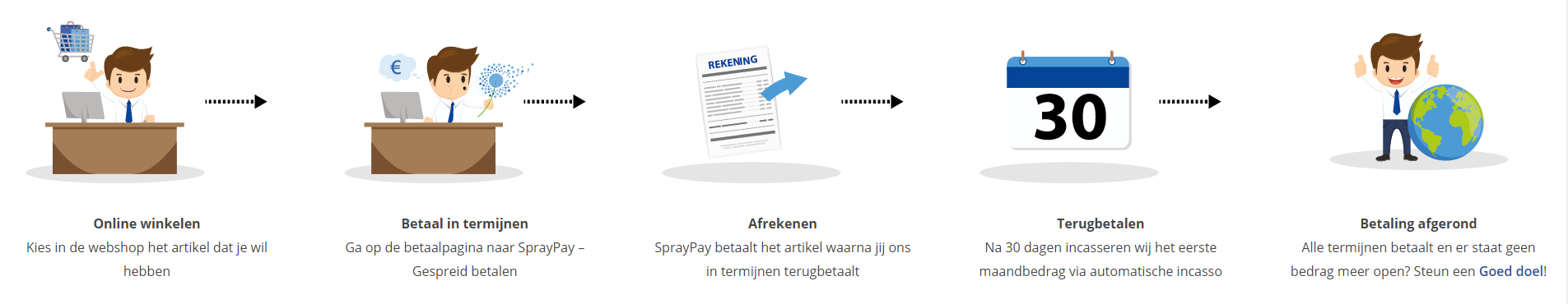
Betaal in termijnen
| Cursusnaam | |
| Looptijd | |
| Rentebedrag financiering | |
| Totaal bedrag | |
| Maandbedrag |

Gespreid betalen met Spraypay
Met de betaaloptie SprayPay kun je jouw bestelling van € 250,- tot € 3.500,- veilig en gespreid betalen in gelijke termijnen van 12, 18, 24 of 36 maanden. Je hebt op die manier een minimale financiële belasting en je kunt eenvoudig de termijnbetalingen opnemen in jouw vaste lasten.
Hoe werkt het kopen op afbetaling? De beoordeling van de kredietaanvraag vindt online plaats. Binnen enkele seconden weet je of je in aanmerking komt voor een krediet. Is de aanvraag akkoord dan kun je meteen genieten van je aankoop.
Let op: deze betaalmetode is aleen beschikbaar voor particulieren! Bekijk voor je aankoop ook de SprayPay voorwaarden.
Via ons opleidingsconcept bespaar je tot 80% op trainingen
Start met leren wanneer je wilt. Je bepaalt zelf het gewenste tempo
Spar met medecursisten en profileer je als autoriteit in je vakgebied.
Ontvang na succesvolle afronding van je cursus het officiële certificaat van deelname van Icttrainingen.nl
Krijg inzicht in uitgebreide voortgangsinformatie van jezelf of je medewerkers
Kennis opdoen met interactieve e-learning en uitgebreide praktijkopdrachten door gecertificeerde docenten
Orderproces
Once we have processed your order and payment, we will give you access to your courses. If you still have any questions about our ordering process, please refer to the button below.
read more about the order process
Een zakelijk account aanmaken
Wanneer u besteld namens uw bedrijf doet u er goed aan om aan zakelijk account bij ons aan te maken. Tijdens het registratieproces kunt u hiervoor kiezen. U heeft vervolgens de mogelijkheden om de bedrijfsgegevens in te voeren, een referentie en een afwijkend factuuradres toe te voegen.
Betaalmogelijkheden
U heeft bij ons diverse betaalmogelijkheden. Bij alle betaalopties ontvangt u sowieso een factuur na de bestelling. Gaat uw werkgever betalen, dan kiest u voor betaling per factuur.

Cursisten aanmaken
Als u een zakelijk account heeft aangemaakt dan heeft u de optie om cursisten/medewerkers aan te maken onder uw account. Als u dus meerdere trainingen koopt, kunt u cursisten aanmaken en deze vervolgens uitdelen aan uw collega’s. De cursisten krijgen een e-mail met inloggegevens wanneer zij worden aangemaakt en wanneer zij een training hebben gekregen.
Voortgangsinformatie
Met een zakelijk account bent u automatisch beheerder van uw organisatie en kunt u naast cursisten ook managers aanmaken. Beheerders en managers kunnen tevens voortgang inzien van alle cursisten binnen uw organisatie.
What is included?
| Certificate of participation | Yes |
| Monitor Progress | Yes |
| Award Winning E-learning | Yes |
| Mobile ready | Yes |
| Sharing knowledge | Unlimited access to our IT professionals community |
| Study advice | Our consultants are here for you to advice about your study career and options |
| Study materials | Certified teachers with in depth knowledge about the subject. |
| Service | World's best service |
Platform
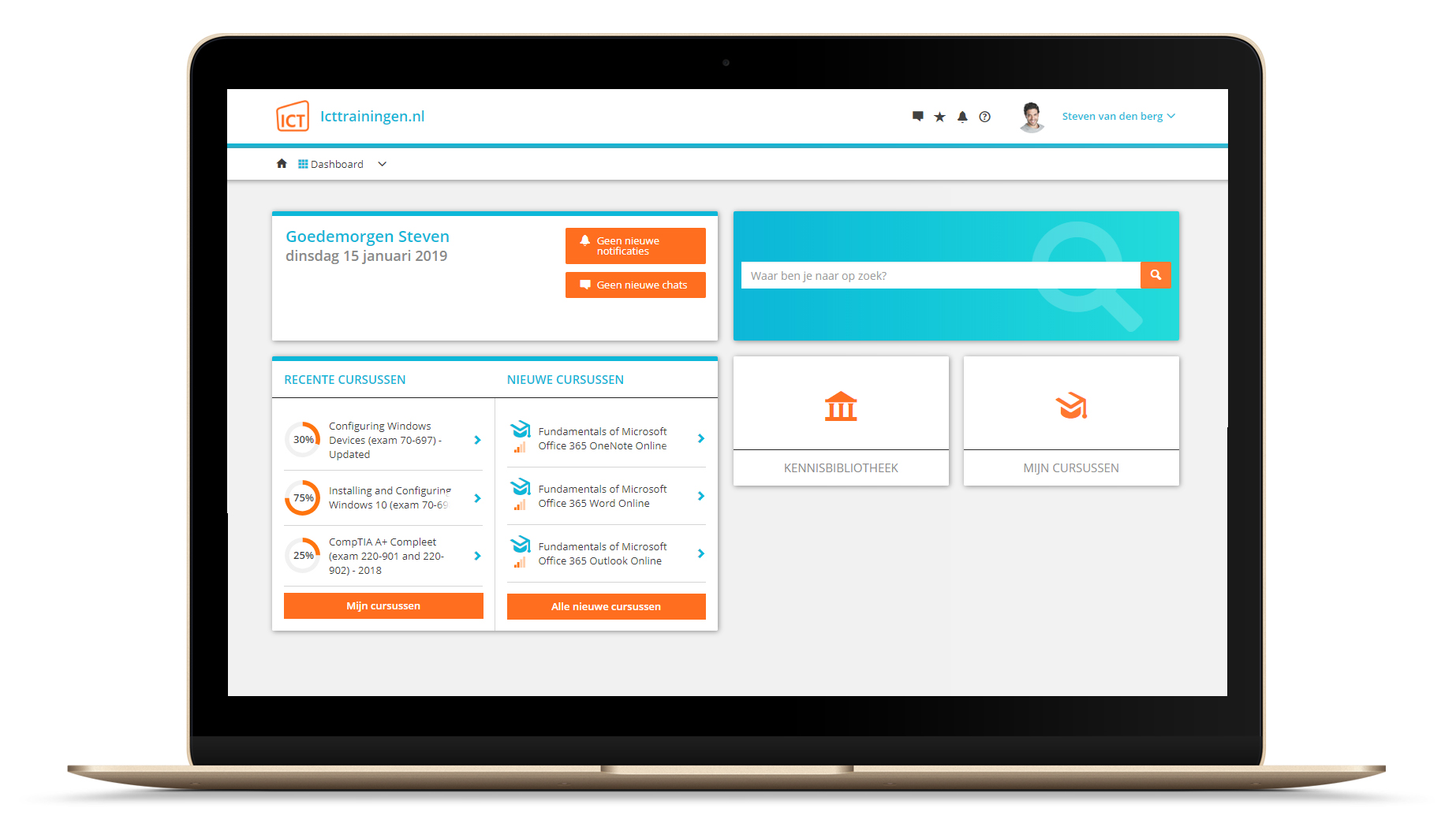
Na bestelling van je training krijg je toegang tot ons innovatieve leerplatform. Hier vind je al je gekochte (of gevolgde) trainingen, kan je eventueel cursisten aanmaken en krijg je toegang tot uitgebreide voortgangsinformatie.
FAQ
Niet gevonden wat je zocht? Bekijk alle vragen of neem contact op.